Zimbra Mobile
Challenge Deliver a mobile experience for Zimbra mail to allow users to access Zimbra mail features on the go
Solution Design native email apps for iOS and Android that leveraged standard iOS/Android/Mobile UX patterns but differentiated themselves from the many native email clients in the marketplace
Role Sole Interaction and Visual Designer for iOS Native App from start to finish. Collaborated with another designer for the Android App.
Background
Zimbra delivers an experience for Email (desktop browser) and mobile (mobile browser). The project was to design native iOS and Android apps that leveraged standard iOS/Andoird/mobile patterns so that the app was predictable and easy-to-use. But we needed to make sure we differentiated ourselves from the many, many native email clients in the marketplace. I designed the iOS app and another designer on team designed the Android app.
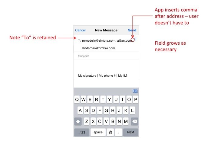
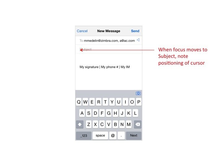
User flow and wireframes
Our User persona for this native app was a consumer looking for clean and simple UI (much like Mailbox or Gmail). Not necessarily someone looking for a lot of functionality and who would easily sacrifice ease-of-use and clean UI over features. Based on this persona, the sprint planning sessions where we decided which user flows to focus on each week, some brainstorming and whiteboarding sessions, I created wireframes to explain the Interaction Design patterns. Again, it was key to heavily leverage standard iOS patterns but also make appropriate adjustments where necessary to distinguish ourselves from competition. I also worked closely with the Android app designer on the project to make sure we were in sync from a project management/workflow POV.



Usability Testing
I performed usability testing along the way to ensure we were headed in the right direction. I am a major proponent of informal prototyping/testing along the way. It's important to validate user flows with actual human beings (and even better, actual users) to see if the UX makes sense to them and whether they are able to accomplish tasks as expected. Often, the design will make sense in the designer's head but not so much when you put it in front of other people. Also, often chatting with other folks reveals insight on some missing key features that would be essential to a delightful user experience.
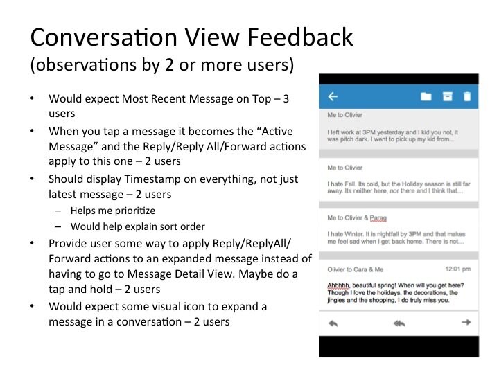
I conducted a usability testing round using 6 users (spanning Engineering, Tech Support, Admin and Product Management). My aim was;
* To gather general feedback on the Conversation view design (list of messages and some details within a conversation/thread)
* To gather general feedback on the Message Detail view design
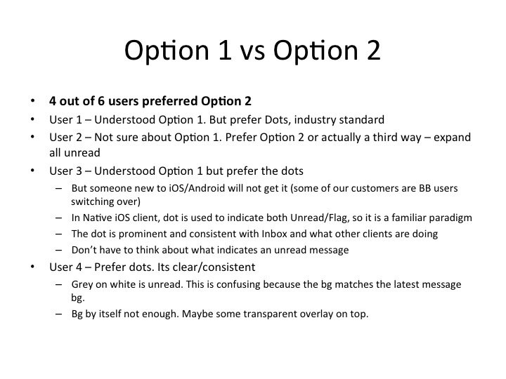
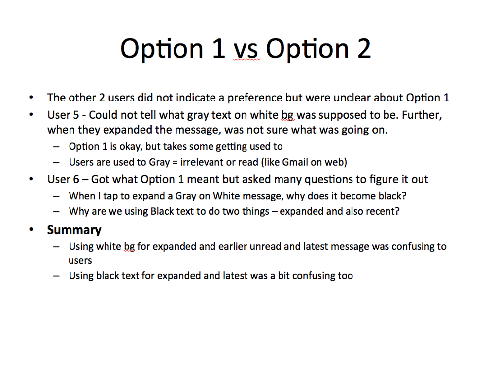
* To test which option users preferred for viewing and marking messages within a conversation read and unread
* To test whether we should auto mark all messages in a conversation read when user goes from conversation view back to Inbox view (even if the user might not have read them all)
Here are a couple of slides from the final report I prepared. We received a ton of useful feedback on the first two points. It definitely gave us user feedback on what they they thought of our design around this feature, what they think of this feature in general, how they approach it in their minds, and use it (or not) in their daily email workflow. This gave us several golden nuggets of wisdom which we used later to revise the design around this feature.


Visual Design Inspiration
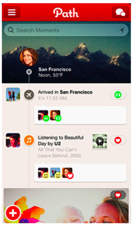
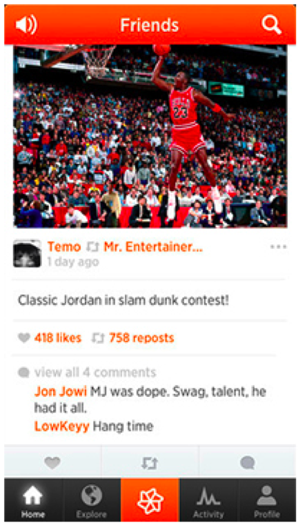
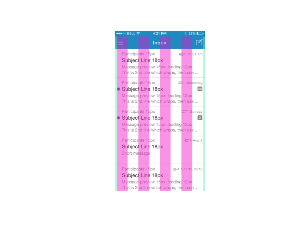
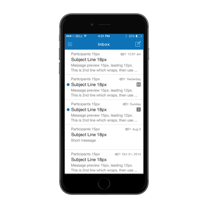
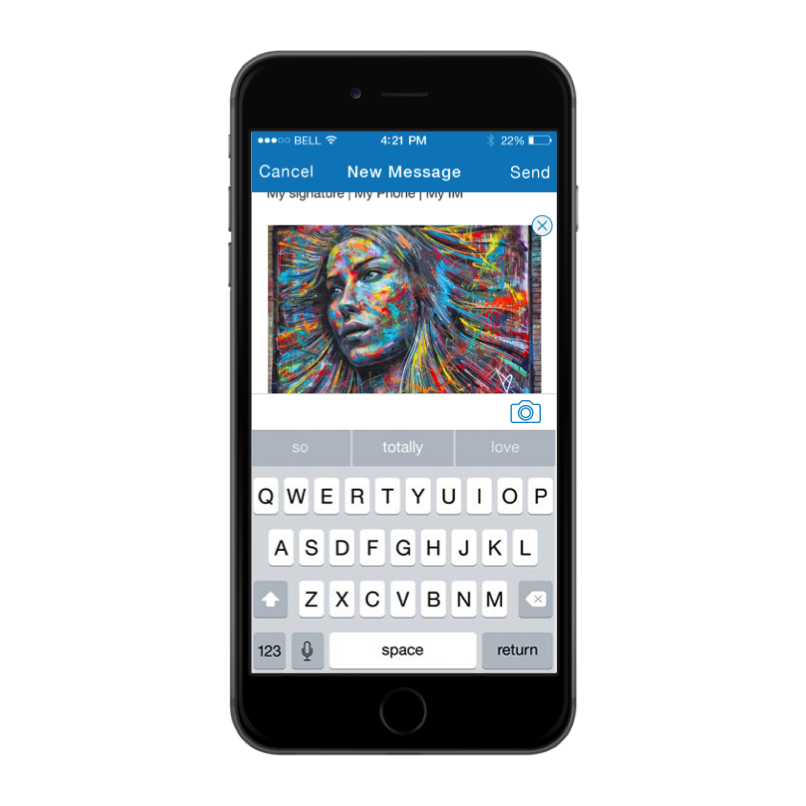
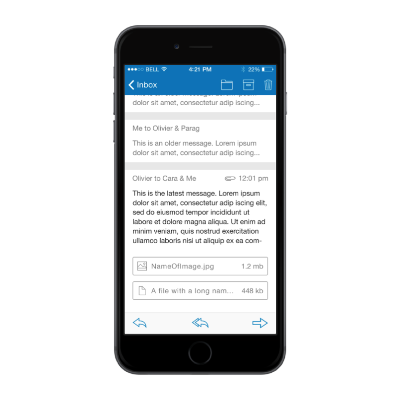
I created design comps, redlines and assets for the Visual Design. I used the iOS font Helvetica neue as the typeface and a palette using Zimbra colors approved by marketing. I looked at Zimbra marketing materials, the website and other apps for inspiration (for individual design elements and also the overall design). Here are some apps that I got inspiration from:
Individual Design Elements
I thought this was an interesting treatment of a badge over a hamburger icon. I wanted to see if we could possibly use this to indicate unread messages over our hamburger icon
Welcome/Signin Flow
Zimbra colors are blue and orange and I wanted to explore if I could use the colors in a vibrant way in the Welcome/sign in flow (instead of having a plan white background with the zimbra logo on it). In the first image, the progress bar at the bottom has a neat interesting treatment and of course, its useful the user. I also like the way they have used the graphics (white clouds). Its an interesting graphic and in Zimbra's case if we used the logo, it would add brand identity too
Other pages
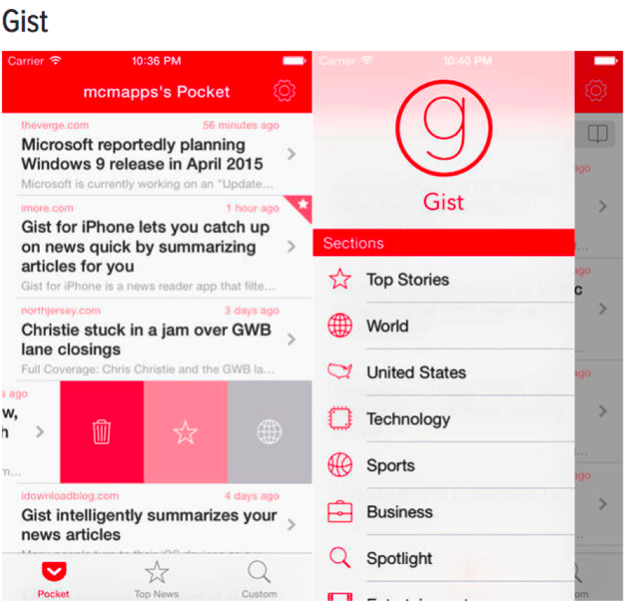


In the following three examples, I like that they are tying together the UI by using the same color in the top bar and buttons (either in all states or in a particular state), icons and header text. This is a good idea but maybe this is visually inconsistent (using the same color to indicate navigation bg and a button or a piece of text). Something I had to keep in mind during design.

Design Process Iterations
I did some sketching/design explorations keeping our user persona and Zimbra's color palette in mind and here are the design processes/iterations I went through


Final Visual Design


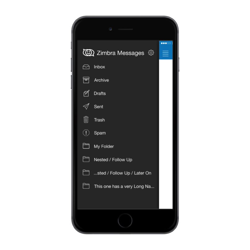
Development
I collaborated with development team to deliver the application. Collaboration was tricky as they were offshore (similar to the Zimbra Chat project) and also an outside vendor. Moreover, I am usually able to rely on my own CSS coding experience to implement/polish and tweak the design. That was not possible this time. So we got around it by:
Again, compromising on meeting times similar to the Zimbra Chat project
Leverage other modes of communication & collaboration - phone, IM, email with lots of visuals and screenprints
Meticulous red lines to communicate pixel perfect dimensions (see below):
Project Outcome
iOS and Android apps were released on the App store in 2016! Internally, we got a lot of praise and encouragement. Externally, they began to track downloads, etc. I left Zimbra shortly after this.
"Manisha came into Zimbra during a very transitional time, where there were an abundance of projects and changes, and a very constrained amount of UX bandwidth to support them. None of that phased her, and she handled the constant changes in direction and projects like the professional she is. She was repeatedly able to take some very cursory requirement information and expound on it with quick wireframe mockups that could be tested, iterated, and tested again until the best solution could be found. She's extremely detail oriented, yet able to quickly grasp the 'big picture' and seamlessly make the transition between the two. If you need to staff a designer position, I highly recommend her."
Josh Johnson, Former Director of UX at Zimbra, now Principal Designer at Splunk


