Zimbra Chat
Challenge Deliver a messaging/audio/video experience within the Zimbra Collaboration Suite (email/calendaring/tasks/files/social)
Solution Leverage strong points of various collaboration types to design an experience that enhances user's productivity and provides a delightful experience
Role Sole Interaction Designer for entire Chat product (Research through IxD). Collaborated with one other Designer for Visual Design.
Background
The objective of the Zimbra Chat project was to deliver a messaging/audio/video experience within the Zimbra Collaboration Suite. The challenge was that Zimbra is one of very few products out there that deliver a Chat experience within a larger experience where many users can spend a lot of time reading and writing significant amount of content in the larger experience (as is done in email). The only other products that come close are Facebook and Google Hangouts. The difference there is the user is not entering in a whole lot of text/attaching files, etc. in the larger Facebook experience. Key for us was to make sure that Chat serves to enhance user's productivity and not hinder their email experience and annoy them.
Competitive Analysis, MVP and Use Cases
I performed a thorough competitive analysis of the big messaging products in the market place on both desktop and mobile - Cisco Jabber, Microsoft Lync, Facebook Messenger, Beejive, Line, Hipchat, Skype, Google Hangouts and Whatsapp. This was a good way to get a lay of the land and see what other messaging products are doing.
Since there was no Product Manager on the project, I stepped in and started creating requirements/use cases. I used the competitive to drive what are the must-have, should-have and nice-to-have features. Using our unique vantage point (email + messaging), I added unique use cases that would separate us from the competition.
Concepting
Whiteboarding, brainstorming, sketching, card sorting
Card sort
Early whiteboard sketches
Design Principles
As with any project, I knew we had to make several design decisions along the way. When making such design decisions, I usually rely on a combination of User Personas, Usability Testing and other data and instinct. Even though we had some of this, I anticipated that it would be tricky to navigate decisions points. So I created a set of a few simple design principles that would help us out:
SIMPLE - Most important, UX needs to be SIMPLE. Less is more.
EASY - Should be easy to chat. We should aim to facilitate chat initiation in as few steps as possible. For Searchers (those who want to find and chat), w e should deliver a powerful search experience. For Browsers (those who want to browse and chat), we should deliver a simple + easy UX. Should not get in the way of Searchers.
HELPFUL flows for user to go between Zimbra Collaboration, Chat, Communities (social product), back and forth. Really help them get more out of their day by using all three.
CONSISTENT UX. Chat would manifest itself in lots of areas across our products. Consistency was key.
The team later was grateful for this as we began to get overwhelmed by the number of use cases and the complex nature of these use cases.
User Flows and wireframes
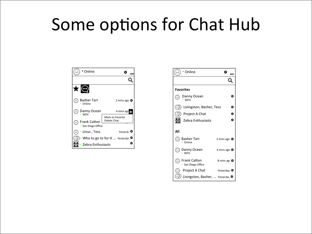
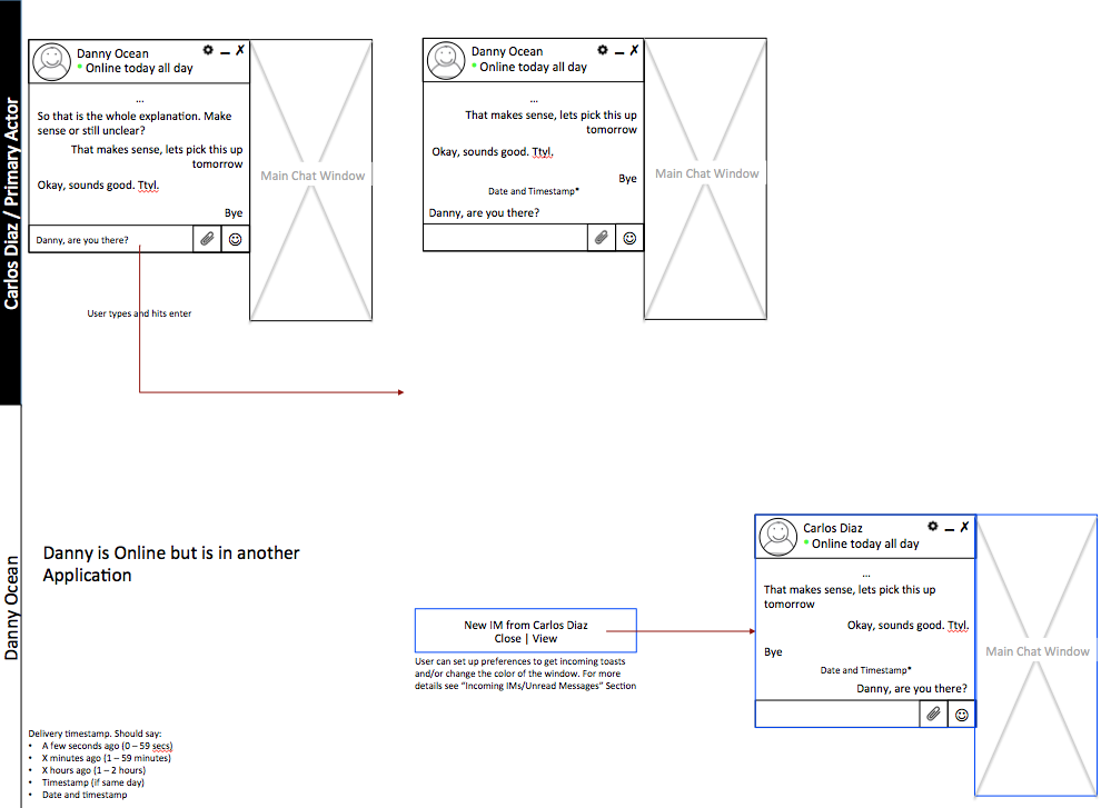
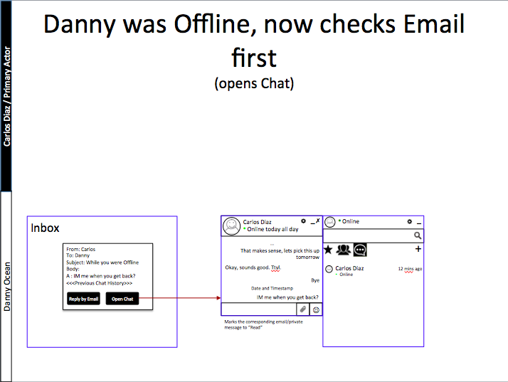
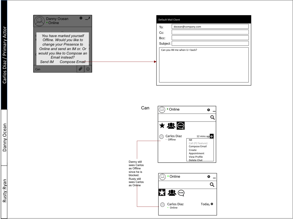
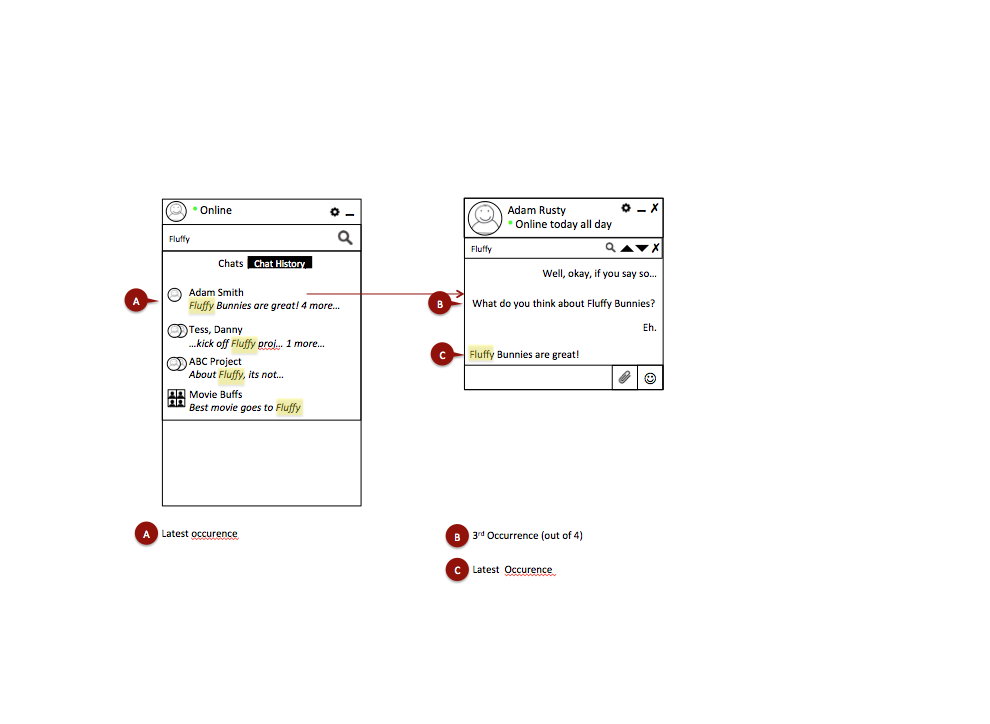
I used the use cases and many whiteboarding sessions to create user flows and wireframes. I collaborated with various parties along the way - cross functional team (Product Management, Engineer), other stakeholders (Support, Partner Services), some Zimbra customers and sample chat users within the company.
There were several tricky user flows, some of which are:
Add or remove multiple users from group chat at various points in the conversation and determining what the experience was for all the user being added/removed and also the other users
Users entering or exiting chat rooms at various points. Again, we needed to determine the experience for the user entering/exiting and also the other users
Escalate to a audio/video call from the messaging experience and continue to maintain the messaging experience within this call
At the time we were trying to integrate the same chat experience across email and also our social enterprise product
Though it was challenging and the team got overwhelmed, it helped us when I reminded them of two points:
The design principles that I had earlier created
We needed to first focus on the user flows that users would execute 80% of the time. While it was important to eventually address the other user flows, it helped to put these use cases in perspective especially the complex ones.










Usability Testing
Did prototype testing at various points along the way to test for usability and validate our design assumptions. When doing usability testing, I assembled users from a wide variety of backgrounds (sales, administrative, engineering, product management, tech support, design). Its also important to not ask leading questions and keep the questions task based "How would you do this?" or "How would you accomplish that?"
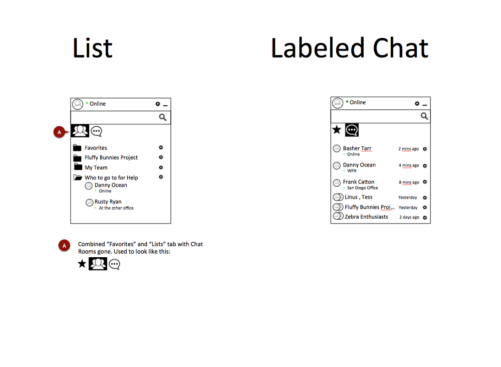
For example - one decision that we needed to make is do we allow users to create a list/folder of their contacts (similar to Lync or Jabber) or do we allow them to label their conversations (similar to Facebook Messenger and Hangouts). Either of these ways would allow users to quickly find contacts or conversations. But both are very different in approach and have pros and cons. So I did an informal usability testing on 6 candidates using paper prototypes and clickable slides.



Client Presentation
In addition to user personas, usability testing and the design principles I created to guide us, we also had client feedback to determine if we were directionally correct. I had the , I also had the opportunity to present some of our WIP designs to existing clients to ensure we were heading down the right direction
Visual Design
I collaborated with another designer on the Visual Design. I also reviewed the HTML and made significant CSS changes to tweak and polish
Development / CSS styling
I worked with development team to implement the appropriate experience. The development team was offshore and the different time zones made it a challenge sometimes. We overcame this in the following ways:
* We compromised on meeting times. I did several late night calls after dinner, they did several late night calls too.
* It also helped that I did not have to rely on them for the CSS changes and was able to take care of this myself. This saved everybody a significant amount of time and eliminated a lot of potential back-and-forth over adjusting pixels.
* We heavily leveraged other modes of collaboration - email, other chat solutions and our own chat solution when we finally had it up and running internally.
One of the nice things about having a programming background is that I can look at the HTML/CSS and do the CSS coding myself. A lot of this work is moving pixels around until you finally get it right. It is nice to not have to rely on or bother the programmers with getting pixels perfectly right. It is also an efficient use of my time as it eliminates the need for red line documents (although I have created many where needed) and also the back-and-forth with the developers.
I find that the programmers respond positively to this as well and begin to see the designers in a positive light.
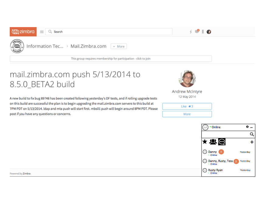
Its not really possible to view the final product in action as one needs a paid Zimbra premium account to access the messaging feature. However here is a screenprint to give you some idea of the work. I reviewed the HTML/CSS for the Chat windows on the bottom right and did the CSS styling myself.
Project Outcome
Zimbra Chat was successfully released to customers in 2016. It has been through various revisions since then and remains a feature in production today.
Lessons Learned
Gained experience in Product Management & Leadership
Design Ownership
Keep your eye on the prize - do not let the corner cases distract you from the 80% use cases
Gained experience in really distilling down Complicated use cases -> Simple UX/UI
"Manisha is a person who thinks beyond the realms of user/customer experience, highly detail oriented and someone on whom you would blindly rely on when it comes to designing application experience. Humble, modest and soft spoken person who will surely get your work done. I have learned a lot from the inputs she regularly provides us to our Zimbra UI team and wish her luck for her career endeavors."
Ajinkya Chatre, Senior Frontend Developer, VMWare Carbon Black


